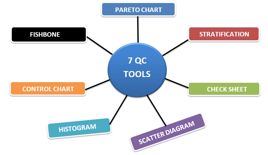
7 QC (Quality Control) tools are very effective for apparel or any other type of factory to solve almost every type of problem in a factory operation. These are the tools of troubleshooting quality issues, based on the numeric value. 7 QC tools in the apparel industry are a set of data analysis tools used to support continuous quality improvement efforts. If you can use these seven fundamental tools, then definitely quality control will be effective for your company.
7 QC Tools in Apparel Industry
- Histogram
- Check Sheet (Tally Sheet)
- Cause-and-Effect Diagram
- Pareto Chart
- Scatter Diagram
- Control Chart
- Stratification
Benefits of 7 QC Tools
- Improve management decision-making skills
- Collect, present, Identify and analyses data
- Implement Six Sigma
- Control cost of poor quality
- Reduce variations and improve quality
- Reduce defects and improve production
- Reduce cycle time and improve efficiency
- Continuous quality improvement
- Encourages teamwork and confidence
- Enhances customer satisfaction through improved quality product
Explanation of 7 QC Tools for Apparel Industry
Histogram
The histogram is also a bar chart. It is a graphical chart based on numeric value for showing the frequency distribution of the database. People become confused among Histograms and Bar Charts. A histogram is used for continuous data, where the bins represent ranges of data, while a bar chart is a plot of categorical variables. Some authors recommend that bar charts have gaps between the rectangles to clarify the distinction.
Download: Histogram Template (excel 31kb)
Check Sheet (Tally Sheet)
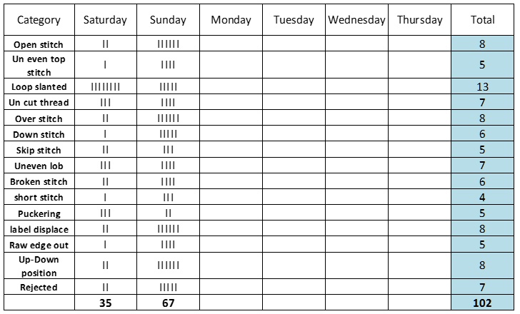
The Check Sheet/Tally sheet is a simple document that is used for collecting data in real-time and at the location where the data is generated. A document is typically a blank form that is designed for the quick, easy, and efficient recording of the desired information, which can be either quantitative or qualitative. When the information is quantitative, the check sheet is sometimes called a tally sheet. A tally sheet to collect data on the frequency of occurrences which custom-designed by the user.
Download: Tally-sheet-template (excel 75kb)
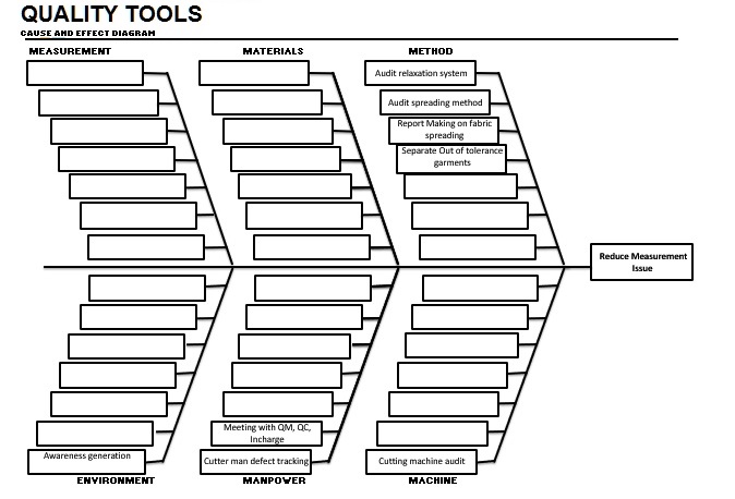
Cause-and-effect diagram (Ishikawa Diagram / Fishbone Diagram)
A cause-and-effect diagram looks like a fish that’s why it’s called Fishbone Diagram, also called Ishikawa diagram, herringbone diagrams or Ishikawa diagrams, a visualization tool for categorizing the potential causes of a problem in order to identify its root causes. Causal diagrams created by Kaoru Ishikawa that show the causes of a specific event. Dr. Kaoru Ishikawa developed the “Fishbone Diagram” at the University of Tokyo in 1943. To break down (in successive layers of detail) root causes that potentially contribute to a particular effect. This diagram is used in process improvement methods to identify all of the contributing root causes likely to be causing a problem.
How to Work on Fishbone
If you find a problem and want to make a fishbone diagram. First, need brainstorming about the defect to find out types of causes based on 6 basic things. These are:
- Machine
- Manpower
- Environment
- Method
- Materials
- Measurement
Brainstorm all the possible causes of the problem. Ask: “Why does this happen?” As each idea is given, the facilitator writes it as a branch from the appropriate category. Causes can be written in several places if they relate to several categories. For example, you can see fishbone in the below:
Download: Cause and Effect Diagram Template (excel 34kb)
4. Pareto Chart (80/20 Rule)
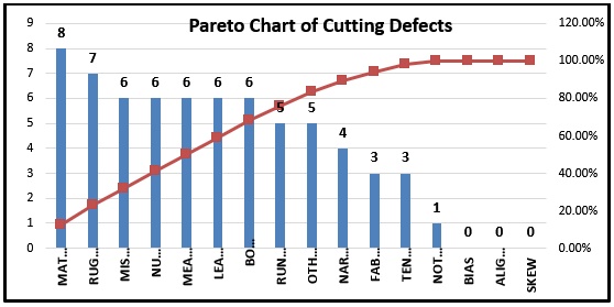
A Pareto chart is a bar graph. The lengths of the bars represent frequency or cost (time or money) and are arranged with the longest bars on the left and the shortest to the right. In this way, the chart visually depicts which situations are more significant.
The Pareto principle
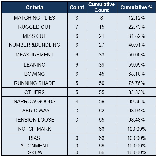
The Pareto principle (also known as the 80–20 rule, the law of the vital few, and the principle of factor sparsity) states that, for many events, roughly 80% of the effects come from 20% of the causes. More generally, the Pareto Principle is the observation (not law) that most things in life are not distributed evenly. In the apparel industry, you can see the data in the below that first 5 defects covered 50% of a total defect. So 80-20 rules will not cover all-time 80% problem for 20% causes. It can mean all of the following things:
- 20% of the defects number cumulate 80% of the total defects
- 20% of the operator produce 80% of the defects
- 20% of the customers create 80% of the revenue
Download: Pareto Chart Template (excel 25kb)
5. Scatter Diagram
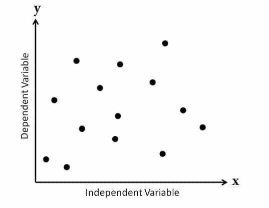
The scatter diagram graphs pairs of numerical data, with one variable on each axis, to look for a relationship between them. If the variables are correlated, the points will fall along a line or curve. The better the correlation, the tighter the points will hug the line. The scatter diagram Collect pairs of data where a relationship is suspected.
6. Control Chart (Shewhart Chart)
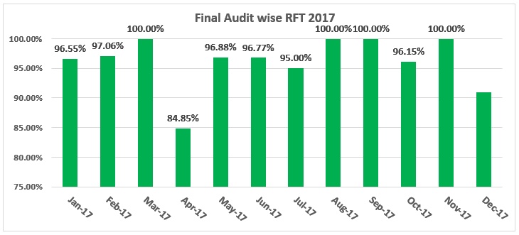
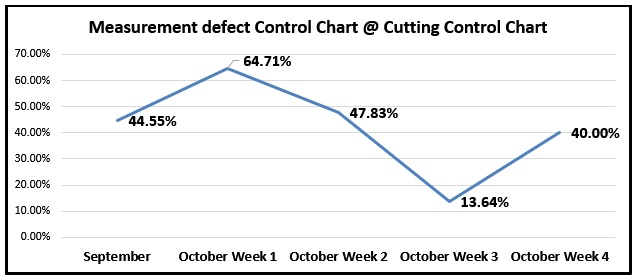
Control charts, also known as Shewhart charts or process-behavior charts, are a statistical process control tool used to determine if a manufacturing or business process is in a state of control. A control chart shows how data frequency changes, defects trends and compares with a previous time record. Control chart monitor process and hypothetical prediction. The apparel industry needs to reduce defect frequency to get quality improvement.
Download: Control Chart Template (excel 17kb)
7. Stratification (Divide and Conquer), can be alternative of flow chart or run chart
Stratification is a method of dividing data into subcategories and classify data based on a group, division, class, or level that helps in deriving meaningful information to understand an existing problem. The main purpose of Stratification is to divide the data and conquer the meaningful information to solve a problem. The visual nature of the chart makes patterns jump out.
Implementation of 7 QC Tools
To implement these tools in your industry, you must have to do Pareto, Fishbone for every section. Result publishes visibly in each line or area inboard. People will be conscious to reduce defect. There improvement tracking on the control chart also visible for each line/area. You have to find the root cause from the root level for the cause and effect diagram. Data and data collection must be accurate. Every section has to be taken corrective action based on quality data. Every section must do a quality meeting to take a new decisions for quality control at least once per month.

Sir,
Kindly guide me how to reduce DHU to zero in jeans sewing production Line section wise.
Thanks for the information
Mr. Nawaz, we will have separate writing on it. Mr. Rashedul, You r welcome. Stay with us to get more like it.
Thanks for sharing excellent informations. Your site is very cool. I’m impressed by the details that you have on this web site. It reveals how nicely you perceive this subject. Bookmarked this web page, will come back for extra articles. You, my friend, ROCK! I found just the info I already searched everywhere and just could not come across. What an ideal site
Excellent, what a webpage it is! This weblog provides valuable facts to us, keep it up.
Thank-you sir for such a well organized and important knowledge.
Excellent article to learn.
Thanks ,it is very important for garments.we are working at new quality meted.it is very needed garments field.we are searching in the garments field
Thank you. It is very important garments 7 tools besiss
Thanks usefull
thanks for describe 7 QC tools.
You are most welcome