In fashion, color is often the first element people respond to—sometimes without even realizing it. Before noticing the cut of a jacket or the texture of a fabric, the eye is naturally drawn to how colors interact. A well-balanced combination can make a look feel intentional and refined, while a poor one can create visual tension, even if the design itself is strong.
Color combinations do more than enhance appearance. They influence mood, define style, and shape how a garment is perceived in different contexts. The same piece can feel bold, minimal, or sophisticated simply through a shift in color pairing.
This becomes even more important in today’s visually driven environment, where product images often replace physical experience. Understanding how color combinations work is no longer just a design skill—it is a practical advantage in both styling and presentation.
As digital workflows continue to evolve, tools such as AI recolor are also changing the way fashion brands explore and optimize color variations more efficiently.
Color Psychology in Fashion
Color perception is deeply connected to human psychology. Certain tones naturally trigger emotional responses—often before we consciously process what we are seeing.
For example, warm colors like red, orange, and yellow tend to feel energetic and attention-grabbing, while cooler tones such as blue and green are associated with calmness and stability. Neutral shades, including black, white, and beige, often communicate simplicity, elegance, or versatility.
These associations are not random. They are shaped by both biology and cultural context. A bold red dress might signal confidence or celebration in one market, while appearing overly intense in another. Because of this, color choices in fashion are rarely just aesthetic—they are also communicative.
Principles of Effective Color Combinations
Strong color combinations are rarely accidental. Most successful pairings follow a few fundamental principles that help maintain visual balance and clarity.
One of the most widely used tools is the color wheel, which provides a structured way to understand how colors relate to each other. Based on this, several common combination methods are widely applied in fashion:
- Complementary colors: Colors positioned opposite each other on the color wheel (such as blue and orange) create strong contrast and visual energy. This approach is often used when the goal is to make a look stand out.
- Analogous colors: Colors that sit next to each other (like blue, teal, and green) produce a more harmonious and cohesive appearance. These combinations feel natural and are commonly used in everyday styling.
- Monochromatic combinations: Variations of a single color can create a clean, minimal, and sophisticated look by adjusting brightness or saturation.
Beyond selecting the right colors, proportion also plays a key role. A useful guideline is the 60-30-10 rule:
- 60% primary color—defines the overall tone of the outfit
- 30% secondary color—adds depth and variation
- 10% accent color—provides contrast and visual interest
Understanding these principles makes it easier to create combinations that feel intentional, refined, and aligned with both design goals and audience expectations.
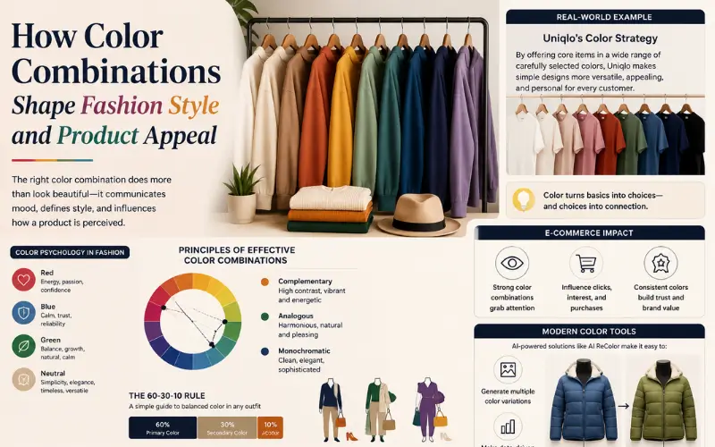
Real-World Color Strategy Example in Fashion
A clear example of color as strategy can be seen in Uniqlo.
Instead of relying on complex designs, Uniqlo builds much of its product appeal around color variation. Core items—such as T-shirts, knitwear, and outerwear—are often released in a wide spectrum of shades, from essential neutrals to more expressive seasonal tones.
What makes this approach effective is balance. By consistently anchoring collections with stable colors like white, black, and navy, Uniqlo creates a reliable base. At the same time, the introduction of brighter or less conventional colors helps these neutrals feel more intentional and visually appealing rather than basic.
This strategy turns color into a key differentiator. Customers are not just choosing a product—they are choosing a tone, a mood, and a way to integrate the piece into their wardrobe.
How Color Influences Product Presentation in E-commerce
The example above shows that color is not just a styling decision. It also plays a major role in how fashion products are presented and perceived in e-commerce. For brands like Uniqlo, releasing the same item in multiple carefully selected colors helps appeal to different customer preferences while giving basic designs a wider visual range.
In digital shopping environments, where customers rely almost entirely on images, these color variations can strongly influence first impressions and purchasing decisions.
Since customers cannot physically interact with garments, product visuals carry the full responsibility of communicating appeal. Color becomes one of the fastest and most immediate signals affecting whether a user clicks, scrolls, or explores a product further.
A well-chosen combination can make a product feel more premium, more versatile, or more aligned with current trends. On the other hand, mismatched or inconsistent colors can reduce perceived value, even if the product itself is well-designed.
Consistency also matters. Brands that maintain a coherent color strategy across product listings often appear more professional and visually trustworthy, which can improve the overall shopping experience.
Modern Approaches to Fashion Color Experimentation
Choosing the right color variation is rarely a one-step process. In fashion, colors are usually tested, adjusted, and refined multiple times before a final direction is selected. As digital workflows become more common, the methods used to explore these variations are also evolving.
Traditional Methods for Testing Color Combinations
Before AI tools became widely accessible, color exploration relied heavily on manual processes. Designers would typically build palettes using references such as trend forecasts, fabric swatches, mood boards, or color wheel principles.
Common steps often included:
- Selecting a dominant base color;
- Testing secondary and accent tones;
- Comparing combinations across different fabrics and lighting conditions;
- Creating multiple mockups or edited product images for review.
Many teams also use software like Adobe Photoshop or Adobe Illustrator to manually adjust garment colors and visualize different outcomes.
While effective, this process can become time-consuming when working with large product catalogs or multiple seasonal color variations.
AI Fashion Design Tools and Recolor Technology
With digital tools becoming more common, color exploration in fashion has become faster and more flexible. Instead of relying only on manual editing, designers now use AI-assisted workflows to quickly test different color variations at the early stage of design.
A key feature in many of these tools is automated recoloring, which allows a single garment image to be visualized in multiple color options almost instantly. This helps designers compare directions without producing physical samples or spending time on repeated edits.
These capabilities are widely used across AI fashion design systems, supporting tasks such as:
- Testing seasonal color palettes;
- Developing early-stage collection ideas;
- Creating product color variations for e-commerce;
- Improving communication between design and merchandising teams.
For example, tools like Fashion Diffusion make it easier to change clothes color digitally and explore different color directions more efficiently. Rather than replacing the design process, these tools support it by speeding up visual experimentation.
Overall, AI-based recoloring is becoming a practical part of modern fashion workflows, especially in digital product development.
Practical Tips for Choosing the Right Color Combinations
In fashion e-commerce, effective color combinations can directly influence how a product is perceived. A few practical strategies can help improve visual appeal more effectively:
- Use neutral base colors to make products feel more versatile and easier to style;
- Maintain color consistency across product listings for a cleaner brand presentation;
- Match color intensity to the target audience. Softer tones often feel more premium, while brighter tones attract attention faster;
- Test multiple color variations to see which versions create stronger visual impact in product images.
Conclusion: Color as a Strategic Design and Marketing Tool
Color combinations are more than a visual detail—they are a central part of how fashion is experienced and understood. From shaping emotional response to influencing purchasing decisions, color plays a critical role at every stage of the process.
As fashion continues to move toward digital-first experiences, the ability to explore and optimize color combinations becomes increasingly valuable. Designers and brands that approach color strategically are better positioned to create compelling visuals, maintain consistency, and adapt quickly to changing trends.
In this context, color is not just about aesthetics. Instead, it is a tool for both design and communication. As digital tools continue to evolve, faster color experimentation and AI-assisted visualization are becoming increasingly important in modern fashion development