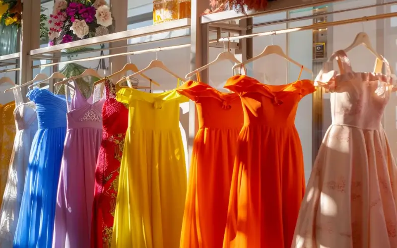
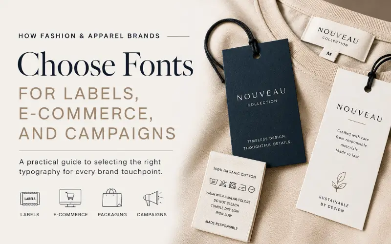
Fashion is visual before it is verbal. A customer may notice a fabric texture, silhouette, color palette, product photo, or logo before reading a single product description. Yet typography quietly shapes the entire brand experience: the clothing label, care tag, hangtag, packaging, website, social ad, lookbook, invoice, and email receipt.
For apparel brands, fonts are not only a design choice. They affect brand perception, readability, legal compliance, production quality, and the long-term cost of marketing assets. A luxury womenswear label, a streetwear drop, a sustainable basics brand, and a performance apparel startup should not use typography in the same way.
The goal is not to choose the most fashionable font. The goal is to choose a type system that fits the product, supports the customer journey, and works across physical and digital touchpoints.
This guide explains how fashion and apparel brands can choose fonts for labels, ecommerce, packaging, campaigns, and brand systems without creating avoidable design or licensing problems.
Why Typography Matters in Fashion and Apparel Branding
Typography gives a fashion brand a recognizable voice. It can make a product feel premium, technical, minimal, rebellious, handmade, athletic, editorial, or accessible.
In apparel, fonts appear in more places than many teams expect:
- woven labels
- printed neck labels
- hangtags
- size stickers
- care tags
- product packaging
- ecommerce product pages
- lookbooks
- paid social ads
- email campaigns
- invoices and receipts
- retail signage
- influencer media kits
- sustainability reports
A font that looks impressive on a mood board may fail on a care label. A logo typeface may look elegant on packaging but become unreadable in mobile product filters. A decorative display font may work for a campaign headline but not for a size chart.
Typography as a business asset
For apparel brands, typography helps connect creative direction with business goals. It supports:
- brand recognition across collections
- customer trust on product pages
- faster reading in size guides and checkout
- clearer packaging and compliance information
- consistent campaign visuals
- more professional wholesale and investor materials
This is where typography intersects with fashion, lifestyle, legal, and finance. Poor font choices can reduce trust, create production errors, or force expensive redesigns later.
Step 1: Match Font Style to Brand Positioning
Before choosing a font, define what the brand should communicate. Apparel typography should match the product category, price point, customer expectations, and visual culture of the market.
| Brand Type | Typography Direction | Why It Works |
| Luxury fashion | High-contrast serif, refined sans serif, elegant spacing | Signals exclusivity, editorial taste, and restraint |
| Streetwear | Bold sans serif, condensed type, expressive display fonts | Feels direct, graphic, and culturally current |
| Sustainable basics | Warm sans serif, soft serif, humanist forms | Communicates transparency and approachability |
| Performance apparel | Technical sans serif, variable sans serif, clean numerals | Supports function, speed, and product innovation |
| Kidswear | Rounded sans serif, playful display accents | Feels friendly and easy to recognize |
| Bridal / occasionwear | Elegant serif, delicate script used sparingly | Suggests ceremony, craft, and emotion |
| Workwear | Sturdy slab serif, industrial sans serif | Signals durability and utility |
A brand selling minimalist linen clothing should not sound visually identical to a sneaker resale platform. A premium skincare-fashion hybrid may need typography that feels quiet and sophisticated, while a cycling apparel brand may need numbers, symbols, and UI labels that feel technical and fast.
Questions to ask before choosing a font
Use these prompts before opening a font library:
- Is the brand premium, affordable, experimental, technical, or heritage-driven?
- Will the font appear mostly online, on fabric, on packaging, or in ads?
- Does the brand need to feel seasonal or timeless?
- Will the same typography support multiple product lines?
- Does the brand sell internationally or in only one language?
- Will the font need clear numbers for sizes, prices, discounts, and measurements?
These questions prevent a common mistake: choosing a fashionable font that does not fit the actual business model.
Fashion typography has to survive production. What works on a large screen may not work when printed at a small size, woven into a label, embossed on packaging, or reproduced on recycled paper.
| Touchpoint | Typography Priority | Common Risk |
| Woven label | Clear brand name and durable letterforms | Thin strokes disappear in production |
| Care tag | Legibility at very small sizes | Condensed fonts become hard to read |
| Hangtag | Brand tone plus product information | Too many styles make the tag messy |
| Packaging | Hierarchy and shelf recognition | Decorative fonts reduce clarity |
| Size label | Fast scanning | Ambiguous numbers or letters |
| Sustainability card | Readable paragraphs | Overly elegant fonts slow reading |
| Wholesale line sheet | Professional clarity | Inconsistent type creates low trust |
Production context matters. A high-contrast serif may look beautiful on a fashion website but lose fine details on a woven label. A narrow typeface may save space on a care tag but make washing instructions harder to read. A script font may work as an accent but become risky for product information.
Label typography rules
For physical apparel materials, keep the system simple:
- use sturdy letterforms for small labels
- avoid ultra-thin strokes
- test the font at final printed size
- check numbers, sizes, and care symbols
- keep decorative type for accents only
- use enough spacing between letters
- request production samples before committing
A font decision should not be approved only from a digital mockup. It should be tested in the actual material, color, size, and printing or weaving method.
Step 3: Make E-Commerce Typography Easy to Read
A fashion website has a different job from a campaign poster. It must help customers understand products quickly: fit, fabric, color, price, return policy, shipping, size, and care instructions.
Good ecommerce typography improves clarity in:
- product titles
- price displays
- sale badges
- size selectors
- product descriptions
- size charts
- filters
- checkout forms
- shipping and return policies
- customer reviews
Where fashion websites often fail
Many apparel websites look visually strong on the homepage but become weaker on product pages. Common problems include small body text, low contrast, hard-to-scan size charts, inconsistent buttons, and fonts that do not render well on mobile.
| Website Element | Recommended Font Behavior | Why It Matters |
| Product title | Clear, medium-weight type | Helps customers identify the item quickly |
| Price | Strong numerals and clear hierarchy | Reduces confusion around discounts |
| Size chart | Highly readable text and numbers | Lowers return risk |
| Product description | Comfortable paragraph font | Helps customers understand fabric and fit |
| CTA button | Clear, confident weight | Improves action clarity |
| Policy text | Legible body font | Builds trust before checkout |
A beautiful ecommerce site can still lose sales if the typography makes sizing, shipping, or product details hard to understand.
Step 4: Compare Free, Commercial, and Custom Fonts
Fashion brands typically choose from three font paths: free fonts, commercial fonts, or custom typefaces. Each can be appropriate depending on stage, budget, and brand ambition.
| Option | Best For | Advantages | Risks |
| Free fonts | Early-stage brands, prototypes, simple campaigns | Low cost, fast access, easy testing | Overuse, unclear licenses, limited weights, weaker uniqueness |
| Commercial fonts | Growing brands, ecommerce, packaging, campaigns | Better family depth, support, licensing clarity, more styles | Requires budget and license management |
| Custom fonts | Established brands, large campaigns, multi-channel systems | Unique voice, long-term recognition, tailored language support | Higher cost and longer production timeline |
| Modified fonts | Brands needing a semi-custom feel | Faster than full custom, more distinctive than ready-made | Must be legally approved by the foundry |
For a young apparel startup, a well-chosen free or commercial font may be enough. For a brand expanding into retail, wholesale, international ecommerce, or frequent campaigns, a deeper commercial family often becomes more practical.
Design teams comparing commercial fonts can review independent foundries such as typetype.org when they need families for branding, web use, packaging, multilingual layouts, or future customization. The strongest test is not the font specimen; it is the font inside real product pages, labels, ads, and campaign copy.
What to test before committing
Before approving any font, test it with:
- the brand name
- collection names
- product titles
- sizes and measurements
- prices and discounts
- care instructions
- return policy text
- fabric descriptions
- social ad headlines
- email subject lines
- packaging copy
A font that works only for the logo is not a complete apparel typography system.
Step 5: Understand Font Licensing Before Production
Font licensing is both a legal and financial issue. A font is software, and the license defines where and how it can be used. Apparel brands should check usage rights before sending files to printers, developers, packaging vendors, ad teams, or retail partners.
| License Area | Apparel Brand Example | What to Check |
| Desktop | Designer creates labels, lookbooks, packaging | Number of users and workstations |
| Webfont | Font appears on ecommerce site | Domain, traffic, pageview, or usage limits |
| App | Font appears in shopping or loyalty app | App embedding rights |
| Logo use | Font is used in brand mark | Whether logo creation is allowed |
| Packaging | Font appears on boxes, tags, inserts | Print and commercial production rights |
| Social ads | Font appears in paid campaigns | Advertising usage rights |
| Video | Font appears in reels, launch videos, ads | Broadcast or video permissions |
| Server use | Font generates custom product previews | Server-side generation rights |
| Modification | Font is edited for the logo or custom system | Permission to alter and rename |
Licensing mistakes to avoid
Common licensing mistakes include:
- using a personal-use font for a clothing brand
- assuming a desktop license covers ecommerce
- sending font files to vendors without permission
- modifying a font without checking the EULA
- using the same license across multiple brands
- embedding a font in an app without an app license
- forgetting to document who owns the license
A brand may not notice these issues during launch, but they can become expensive during a rebrand, acquisition, wholesale expansion, or legal review.
Simple font license folder
Every apparel brand should keep a folder with:
- font name and version
- source or foundry
- license file
- invoice or receipt
- allowed users
- allowed websites and domains
- app or server permissions
- modification rules
- renewal or subscription terms
- vendor usage notes
This small operational habit can prevent confusion when creative teams, developers, agencies, or manufacturers change.
Step 6: Learn From Custom Typeface Cases
Custom typefaces are useful when a brand needs a distinctive voice across many touchpoints. They can also solve practical problems such as language coverage, UI readability, or campaign consistency.
Google Sans
Google Sans shows how a brand type system can support interfaces, marketing, and product consistency at scale. Google Fonts describes Google Sans as Google’s current brand typeface and notes that it is available as a variable font with axes including weight, grade, and optical size. That flexibility is useful in digital systems where one brand voice must work across many contexts.
Snickers Sans
Snickers Sans is a strong example of typography built from brand recognition. Studio DRAMA describes the project as a type system that transforms the Snickers logo into a complete brand language and supports more than 300 languages, including Greek and Cyrillic. For fashion brands, the lesson is clear: a recognizable wordmark can become the foundation for a larger typographic system when the brand has enough scale.
O2 custom typeface
O2’s custom typeface case shows how typography can modernize a brand across markets and digital experiences. Monotype’s case study describes the typeface as part of O2’s move toward a more digital and contemporary brand across different markets. Apparel brands can apply the same principle at smaller scale: when a brand appears across ecommerce, retail, packaging, wholesale, and campaigns, type consistency becomes a strategic asset.
Common Typography Mistakes in Fashion Branding
Fashion brands often make font decisions under pressure: a launch date is close, packaging is due, or the website needs to go live. That is when mistakes happen.
Common mistakes include:
- choosing a font only because it is trending
- using too many fonts in one brand system
- selecting a logo font that cannot work anywhere else
- ignoring care label readability
- using thin strokes on textured materials
- relying on low-contrast typography in ecommerce
- failing to test numbers in prices and size charts
- using free fonts without checking commercial rights
- mixing luxury and streetwear type styles without a strategy
- changing campaign fonts so often that the brand loses recognition
The most damaging mistake
The biggest mistake is treating typography as decoration instead of infrastructure. A font system affects production, website usability, marketing speed, licensing cost, and brand memory.
If a typeface cannot support labels, packaging, ecommerce, ads, and future product categories, the brand will eventually need to rebuild the system.
Font Selection Checklist for Apparel Brands
Before finalizing a font, review this checklist:
- Does the font match the brand’s market position?
- Is it readable on mobile product pages?
- Does it work on labels, tags, and packaging?
- Are numbers clear for prices, sizes, and measurements?
- Does it support all required languages?
- Does it include enough weights and styles?
- Is the webfont license clear?
- Can the font be used in packaging and ads?
- Are vendors allowed to access or use the font files?
- Will the font still work as the brand expands?
Fast decision table
| If Your Brand Is… | Start With… | Avoid… |
| Pre-launch apparel startup | Free or affordable commercial font | Over-customizing too early |
| Growing DTC fashion brand | Commercial family with web license | Fonts with limited weights |
| Luxury label | Refined serif or elegant sans system | Overly generic templates |
| Streetwear brand | Bold display plus readable text font | Using display fonts everywhere |
| Performance apparel brand | Technical sans or variable font | Weak numerals and cramped UI text |
| Multi-market brand | Commercial or custom multilingual system | Fonts without language support |
FAQ
What fonts are best for fashion brands?
There is no single best font for every fashion brand. Luxury brands often use refined serifs or elegant sans serifs, while streetwear may use bold condensed or expressive display fonts. The right choice depends on positioning, audience, product category, and usage.
Can apparel brands use free fonts commercially?
Yes, but only if the license allows commercial use. Brands should also check whether the font can be used in logos, packaging, websites, apps, ads, and modified artwork.
Do fashion brands need custom fonts?
Not always. Many brands can build a strong identity with a commercial font family. Custom fonts become more valuable when the brand needs distinctiveness, multilingual support, technical control, or consistency across many channels.
What is the best font for clothing labels?
The best font for clothing labels is readable at small sizes, durable in production, and consistent with the brand identity. Avoid ultra-thin, overly decorative, or tightly condensed fonts for care labels and size information.
Why does font licensing matter in fashion?
Font licensing matters because apparel brands use fonts across many commercial touchpoints: packaging, labels, ecommerce, ads, videos, lookbooks, and sometimes apps. Each use may require specific rights.